
Good wayfinding keeps people moving—and engaged.
Event Signage for Networking Guide

Content
Last month, I watched 300 professionals stream into a downtown conference center. Within eight minutes, something strange happened. Instead of dispersing into the venue, they clustered near the doors—phones out, heads swiveling, looking increasingly frustrated. They weren't networking. They were lost.
Registration wasn't marked. The keynote room? Anyone's guess. Coat check might as well have been invisible.
Here's what most planners miss: bad signage doesn't just annoy people. It actively destroys what you're trying to create. When your guests burn mental energy trying to figure out where they're supposed to be, they've got nothing left for conversations that matter. Sessions start half-empty. Sponsor booths get ignored. Attendees leave thinking your event felt "chaotic"—even when your programming was perfect.
The psychology here isn't complicated. Confusion creates stress. Stress makes people shut down. At networking events—where attendees already feel anxious about approaching strangers—navigational confusion just makes everything worse. Smart signage functions as your silent co-host, handling the basics so your actual team can focus on meaningful interactions.
There's also this: consistent branding across your signs creates subconscious credibility. Well-marked events feel professionally managed, which increases participation, encourages information sharing, and drives repeat attendance. People trust what looks intentional.
Essential Signage Types Every Networking Event Needs
You need layered systems for event signage for networking. Miss one layer, and you've created a bottleneck. Here's what actually works.
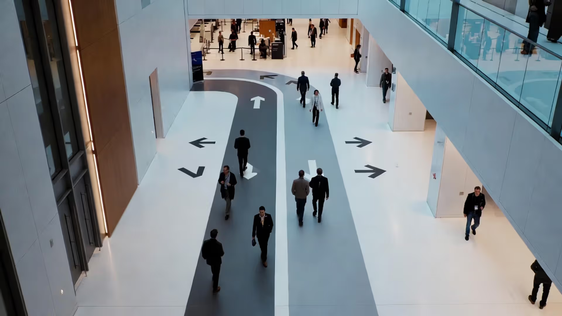
Directional and Wayfinding Signage
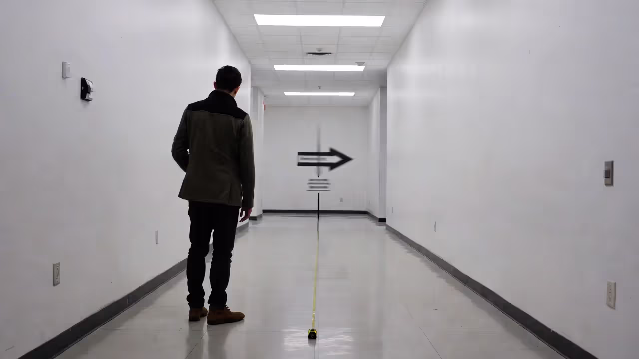
These answer one question on repeat: "Where am I supposed to go?" You'll want them at every single spot where people have to make choices—lobby entrances, where hallways intersect, stairwell exits, anywhere near elevators. Good wayfinding design combines arrows with distances and specific room names. "Breakout Sessions ← 50 feet" beats "Conference Rooms This Way" every single time.
Multi-floor venues need floor numbers plus visual landmarks. Try "Registration – 2nd Floor, next to the glass atrium." Now attendees have two ways to confirm they're headed the right direction. Also think about sight lines: can someone spot your sign from at least 15 feet away when the hallway's packed?
Author: Sophie Bennett;
Source: isnvenice.com
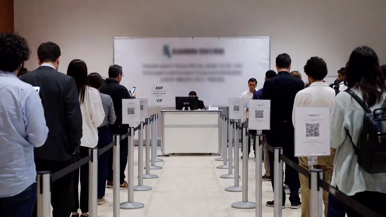
Registration and Check-In Markers
Registration needs three distinct sign layers. First, outdoor signs that guide people from parking or transit stops. Second, massive banners that identify your registration zone from 30+ feet out. Third, individual desk labels like "A-G," "H-P," or "VIP/Speaker Check-In" so people don't all pile into one line.
If you're expecting queues (and let's be honest, you probably are), add wait-time estimates. Something as basic as "Estimated wait: 5 minutes" actually reduces how long people feel like they're waiting, just by acknowledging the situation.
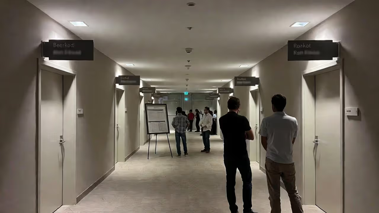
Session and Zone Identifiers
Author: Sophie Bennett;
Source: isnvenice.com
Every breakout room, every lounge, every networking corner needs clear identification. Mount signs on both walls next to doorways—people approach from different directions. For session spaces, include times and topics using digital displays or printed inserts you can swap throughout the day.
For open-floor networking spaces, use hanging banners or those vinyl floor decals to define zones: "Industry Roundtables," "One-on-One Speed Networking," "Coffee & Casual Conversations." This spatial setup helps attendees pick spots based on what they're actually trying to accomplish, which improves attendee navigation significantly.
Sponsor and Branding Displays
Sponsor signage does double duty: it fulfills your contracts while enhancing visual communication events. Put platinum sponsors near high-traffic choke points, supporting sponsors in secondary areas. This maintains your hierarchy without making the venue look cluttered.
Weave your event brand throughout everything. Step-and-repeat backdrops for photos, branded directional signs, cohesive colors—all of it transforms boring rental spaces into experiences that feel intentional. Plus, this consistency makes wayfinding easier because attendees start following your color scheme without thinking about it.
| Signage Type | Primary Purpose | Ideal Placement | Material Recommendations | Approximate Cost Range |
| Directional/Wayfinding | Gets attendees from Point A to Point B without confusion | Hallway intersections, building entrances, elevator lobbies | Foam board for indoor use, coroplast for outdoor, vinyl decals for floors | $15-75 each |
| Registration Markers | Identifies check-in areas and prevents bottlenecks | Building entrance (visible from parking), lobby, desk fronts | Retractable banners, acrylic desk stands, ceiling-mounted hanging signs | $80-300 per unit |
| Session Identifiers | Labels individual rooms and keeps schedules updated | Both sides of room entrances, visible from hallway sight lines | Digital screens for flexibility, slide-in frames, magnetic boards | $25-500 per room |
| Sponsor/Branding Displays | Delivers sponsorship value while reinforcing your event identity | High-traffic corridors, designated photo areas, stage backdrops | Fabric tension walls, step-and-repeat vinyl banners, backlit LED displays | $200-2,500 per display |
| Floor Graphics | Directs foot traffic flow and creates unexpected branded touchpoints | Main pathways with heavy traffic, queue waiting areas, Instagram-worthy photo spots | Textured vinyl decals with slip-resistant coating | $50-200 each |
7 Conference Signage Ideas That Boost Attendee Engagement
Standard arrows pointing left or right? They work fine. But creative conference signage ideas turn boring necessities into tools that actually get people engaged.
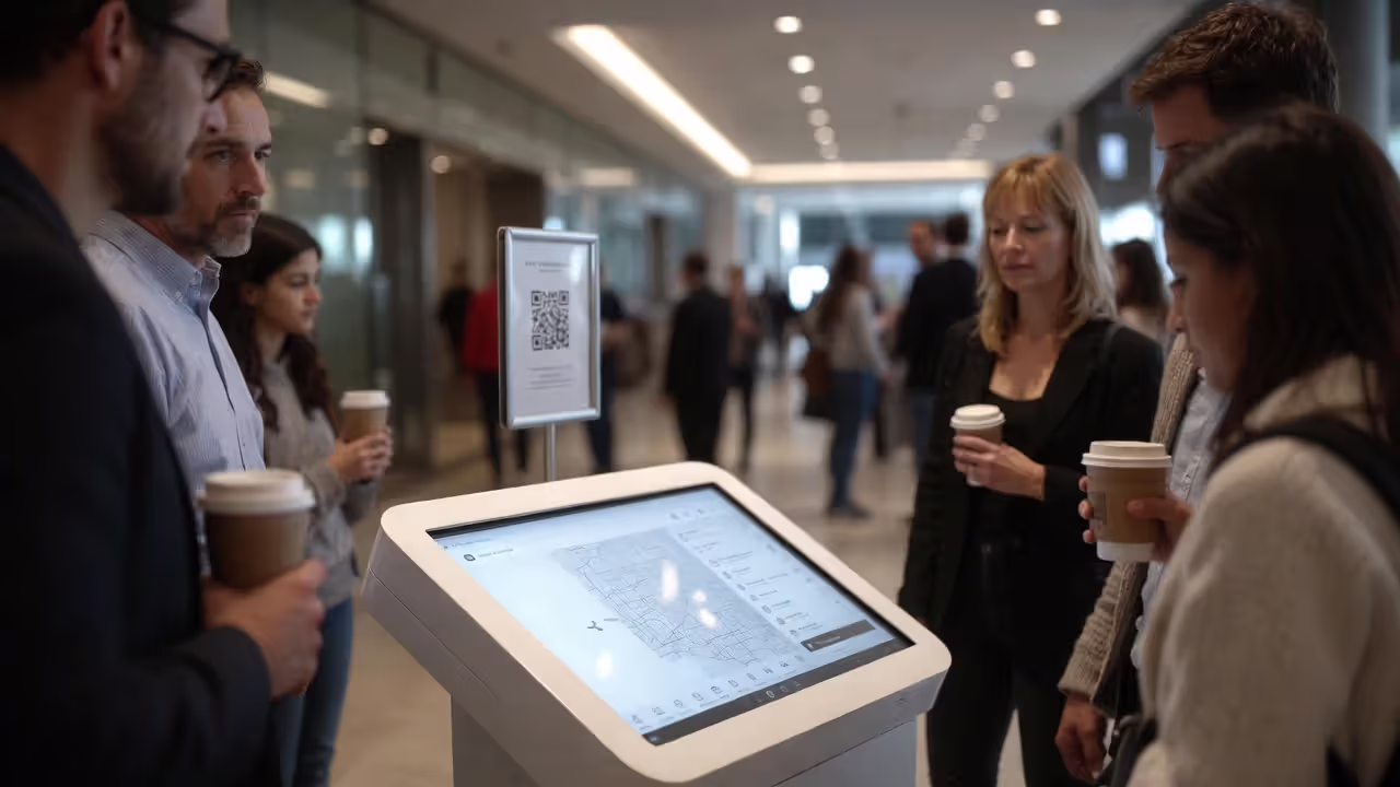
Interactive Digital Displays: Set up touchscreen kiosks displaying real-time agendas, speaker bios with photos, and interactive venue maps. Attendees can look stuff up themselves instead of hunting down staff. Bonus benefit: these systems capture analytics showing which sessions are generating the most pre-event interest, which helps you staff rooms appropriately.
Author: Sophie Bennett;
Source: isnvenice.com
Floor Graphics with Purpose: Those adhesive vinyl floor decals can do way more than just point directions. Think footprint trails leading to your networking lounge. Branded geometric patterns in photo zones. QR codes printed right on the floor that people scan while waiting in registration lines. It's playful and functional.
Hanging Banners for Vertical Space: Most convention centers have 20-foot ceilings. Why waste all that space? Suspended banners are visible from across massive rooms, which helps with quick orientation. They're especially critical in open expo halls where floor-level signs completely disappear behind crowds.
Photo-Worthy Branded Walls: Build Instagram-optimized backdrops that attendees actually want to photograph. You get organic social reach; they get shareable content. Design your event hashtag directly into the visual elements—not slapped on as an afterthought, but integrated into the actual design. I've seen these generate hundreds of tagged posts per event.
QR-Enabled Navigation: Print QR codes directly on your directional signs that link to digital maps, detailed session descriptions, or speaker LinkedIn profiles. This bridges physical and digital experiences beautifully, plus it's essential for hybrid events where remote participants need access to the same information.
Color-Coded Pathways: Assign distinct colors to different tracks or themes. "Follow the Green Path for Tech Innovation Sessions," "Follow the Blue Path for Leadership Development." Use colored floor tape, matching banners, and coordinating room markers. Most attendees figure out the system within their first ten minutes, which dramatically cuts down on the mental effort required for attendee navigation.
Chalkboard or Whiteboard Elements: Set aside one "community board" where attendees write notes, post questions, or organize informal meetups. This analog, low-tech interaction frequently sparks conversations that your polished digital tools completely miss. There's something about physically writing on a board that encourages participation.
Wayfinding Design Principles for Seamless Attendee Navigation
The best wayfinding design feels invisible. Attendees end up exactly where they need to be without consciously thinking about how they got there.
Hierarchy and Information Layers: Your primary signs—building entrance, main registration—need larger fonts and bolder colors. Secondary signs providing details about specific breakout rooms should be visible but shouldn't compete visually with your primary markers. Tertiary signs for restrooms and emergency exits stay accessible but understated. This layered approach prevents information overload at critical decision points.
Author: Sophie Bennett;
Source: isnvenice.com
Sightlines and Placement Strategy: Physically stand at each entrance and trace where your eyes naturally go when you pause to orient yourself. Place signs there—not wherever you happen to have wall space available. Corner placements fail constantly because people round corners quickly without stopping. Instead, position signs about three feet before the turn.
Consistency Across Touchpoints: Use identical terminology everywhere. If your printed program calls it "Networking Lounge," don't label your signs "Social Area" or "Casual Meetup Space." Pick one term and stick with it across mobile apps, programs, signage, and announcements. Font families, color palettes, and icon styles should stay uniform too. Inconsistency forces attendees to question whether they're following the right directions or if these are pointing to different spaces.
Accessibility Compliance: ADA guidelines spell out specific contrast ratios, tactile elements, and mounting heights. Beyond avoiding legal problems, accessible design actually benefits everyone—high contrast text reads better in dim lighting, simple icons work across language barriers, and Braille accommodates diverse needs without drawing attention to itself.
Progressive Disclosure: Don't overwhelm arrivals with every single detail the second they walk through the doors. Your entrance signs should communicate exactly three things: where registration is located, where the main stage or keynote space is, and where the nearest restrooms are. Save detailed session information for signs located near the actual session areas, not at building entry.
How to Align Visual Communication with Event Branding
Visual communication events succeed when every sign reinforces brand identity without becoming repetitive or overwhelming.
Typography Choices: Limit yourself to two fonts maximum—one for headlines, another for body text. Sans-serif options like Arial, Helvetica, or Montserrat offer superior readability at distance. Script or decorative fonts work great for event names on feature walls but fail spectacularly on directional signs where people need instant comprehension while walking.
Color Psychology in Practice: Colors trigger subconscious responses whether you plan for it or not. Blue conveys professionalism and trust, making it ideal for corporate conferences. Orange and yellow signal energy and innovation—think tech events or creative summits. Green suggests growth and sustainability for environmental or wellness themes. Let your primary brand color dominate high-impact areas, then use secondary colors for general wayfinding to maintain visual interest without creating chaos.
Author: Sophie Bennett;
Source: isnvenice.com
Logo Placement Strategy: Your logo doesn't belong on every single sign. Overuse dilutes its impact. Feature logos prominently on registration backdrops, stage designs, and designated photo walls. On directional signs, a small logo tucked in the corner maintains brand presence without cluttering the critical information people actually need.
Material Choices Reflect Brand Values: Sustainability-focused events should use recyclable materials—fabric banners instead of vinyl, FSC-certified paper stock, reusable sign frames. Luxury events might invest in acrylic stands, brushed metal finishes, or backlit LED displays. Budget-conscious events can absolutely maintain professionalism using well-designed foam board signs and strategic printing choices. The material itself communicates your values.
Maintaining Guidelines Across Vendors: If multiple vendors are producing your branding signage, provide an extremely detailed style guide. Specify exact Pantone colors (not RGB or CMYK approximations that vary between printers), exact logo files with clear usage rules, precise spacing requirements, and explicit examples of unacceptable modifications. Inconsistent blues or weirdly stretched logos undermine credibility faster than having no signage at all.
Common Event Signage Mistakes (and How to Avoid Them)
Even experienced event planners fall into these predictable traps. Here's what actually goes wrong.
Too Much Text: Your signs aren't brochures. If your directional sign requires more than seven words, it's already too complex. "Breakout Sessions A-D, Second Floor, Turn Right" should become "Sessions A-D → 2nd Floor." Attendees walking at normal speed have roughly two seconds to read, process, and act on your information.
Poor Placement Timing: Mounting signs the morning of your event guarantees you'll discover problems too late to fix them. Arrive the day before to test sight lines under actual lighting conditions. Evening galas need illuminated or backlit signs; morning conferences might face glare issues on glossy materials that look fine under artificial light but become unreadable near windows.
Inconsistent Messaging Across Channels: Your mobile app says "Networking Reception, Grand Ballroom." Your printed program says "Evening Social, Ballroom A." Your physical signage says "Cocktail Hour, Main Hall." Now attendees think these are three different events and half of them miss the reception entirely. Audit every single communication channel before finalizing any signage text.
Ignoring ADA Requirements: Non-compliant signage isn't just legally problematic—it's exclusionary. Mounting heights, Braille placement, color contrast ratios, and tactile elements all have specific standards laid out in the ADA Standards for Accessible Design. For large-scale events, hiring a compliance specialist for a few hours is worth every penny.
Last-Minute Printing Compromises: Rush orders force compromises you'll regret—thinner materials that look cheap, lower resolution that appears blurry from ten feet away, limited size options that are too small for your space. Set print deadlines for two weeks before your event, allowing time for proofing, corrections, and contingency reprints if something goes wrong. Budget 10-15% extra inventory for damaged signs or last-minute room changes that always seem to happen.
Neglecting Takedown Plans: Removing signage takes longer than installing it, and nobody thinks about this until they're facing venue penalties for leaving adhesive residue or wall damage. Assign specific team members to handle removal, give them proper tools (scrapers, adhesive removers, step ladders), and photograph all wall areas before installation to document pre-existing conditions. This documentation has saved me from bogus damage charges multiple times.
I stopped thinking of event signage for networking as decoration about five years ago. We've measured a 34% increase in session attendance and a 28% boost in sponsor booth visits simply by redesigning wayfinding systems. When people know where they're going, they actually go there. It's that simple.
— Marcus Chen, CEM and Director of Conference Operations at Horizon Events Group
Frequently Asked Questions About Networking Event Signage
Event signage for networking accomplishes more than preventing people from getting lost—it fundamentally shapes how attendees experience your entire event. Well-executed wayfinding systems reduce anxiety, increase participation rates, and reinforce brand identity with every single glance. This isn't just functional infrastructure; it's strategic experience design.
Start by mapping actual attendee journeys from the moment they arrive until they leave. Identify every potential confusion point, then deploy specific signage solutions matched to each challenge. Balance creativity with absolute clarity—your conference signage ideas should delight without distracting from core information. Maintain brand consistency across all materials, and always prioritize accessibility requirements.
The best signage goes unnoticed precisely because it works seamlessly. When your event ends, attendees remember productive conversations and valuable connections, not the signs that guided them there. That's the goal—signs that work so well they become invisible.
Allocate 3-5% of your total event budget to signage—lean toward the lower end for small gatherings, the higher end for complex multi-track conferences. Test your complete system with volunteers before opening doors to actual attendees, and actively gather feedback afterward. Each event reveals where people actually looked versus where you assumed they'd look.
Your networking event succeeds when attendees focus on people instead of logistics. When conversations matter more than confusion. Strategic signage makes that focus possible by handling the basics so seamlessly that nobody has to think about them at all.